Improving accessibility and accelerating implementation of the Microsoft design systems 2.0
In January 2019, the Microsoft Cloud + AI team faces a corporate mandate to make all digital products and services accessible by June 2019. However, the lack of accessible design patterns within their web framework posed a daunting obstacle. As a result, individuals with disabilities encountered frustrating and inconsistent user experiences, while the organization faced potential legal and reputational risks due to non-compliance.
Role
UX Design Consultant
Year
2019
Duration
6 months
Deliverables
UI design patterns style guide
Accessibility testing report
High-fidelity mockups
Keyboard interaction design
Usability testing
Final UI specifications
Team
4 Accessibility Experts, Product Manager, and Development Lead
Software and tools
Figma, Photoshop, and Microsoft Accessibility Insights Tool
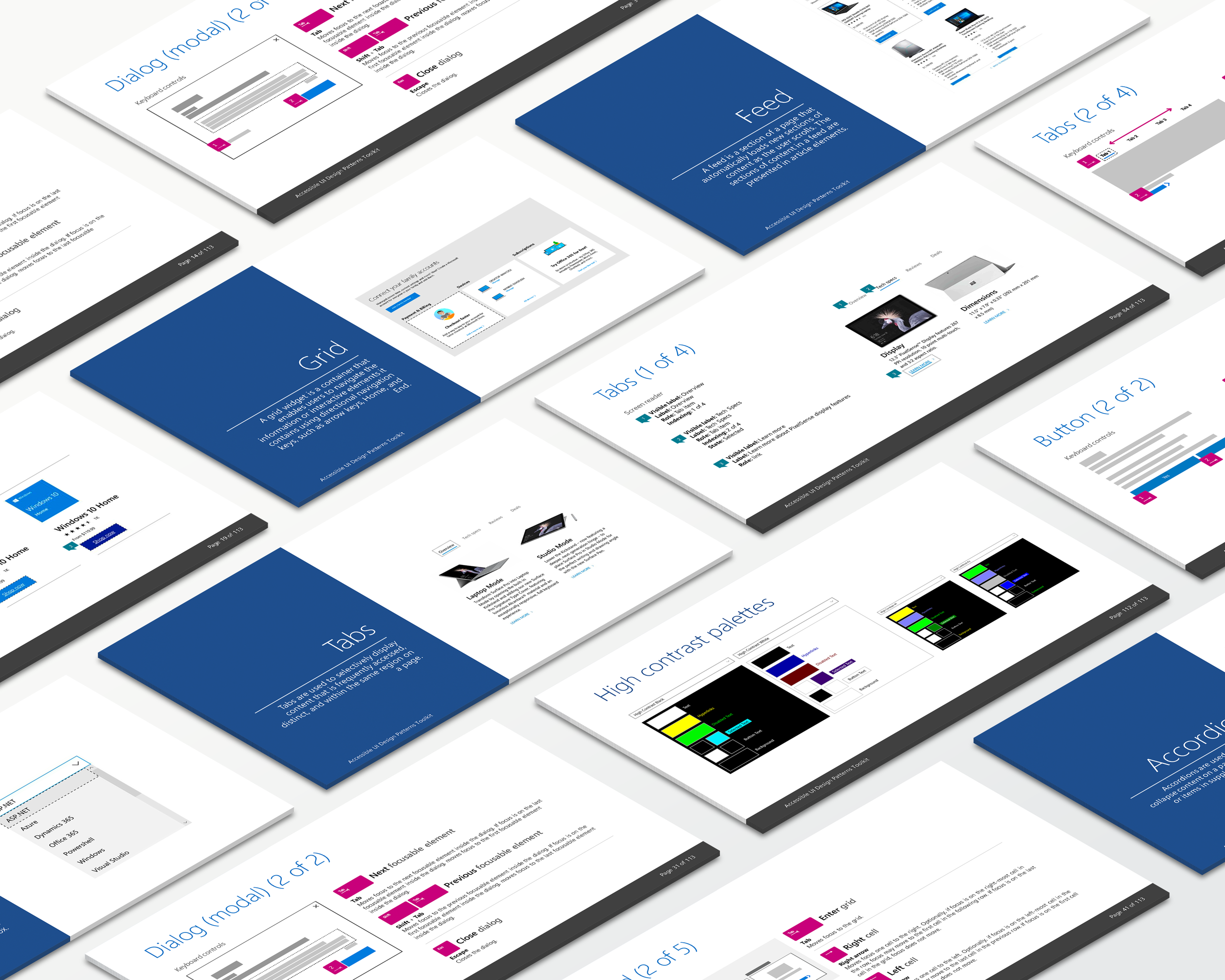
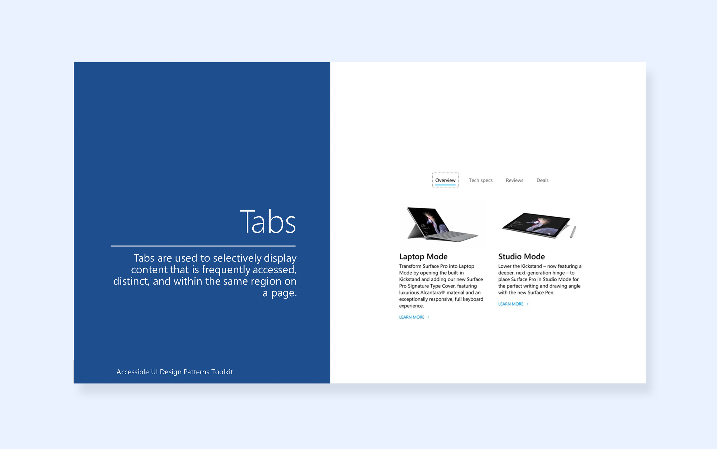
Streamlining reusable UI component implementation for the Microsoft Web Framework
As the UX Design Consultant for Microsoft Cloud + AI team, I lead the UI design patterns remediation efforts with a team of accessibility experts to enhance accessibility and efficiency in under 6 months. Our goal is to ensure all products and services cater to a diverse audience.
Our efforts promote inclusivity and compliance, empowering designers and developers while prioritizing user feedback and education support. Together, we drive Microsoft's mission of accessibility and exceptional user experiences worldwide.

Empowering accessibility through user-centered design and collaborative accessibility testing
We began the accessibility remediation process with comprehensive testing of all UI components, targeting common design patterns from the Microsoft Store website. Using Microsoft brand style guide, we created mockups and ensured accessibility semantics were integrated, validating them with screen reader interactions and collaborating with accessibility experts.
“The pain of ensuring accessibility compliance often feels like an uphill battle, leaving us uncertain about the impact of our designs on users with disabilities.”
Bridging ARIA 1.1 authoring and web accessibility guidelines with the accessibility UI design patterns style guide
Based on user interviews and surveys, designers struggle to grasp ARIA 1.1 authoring guidelines and incorporate web accessibility guidelines into their design process. The Accessibility UI Design Pattern Toolkit provides clear visual representations and interactive examples, enabling designers to understand accessibility semantics and seamlessly incorporate them into their designs, resolving the confusion caused by complex guidelines.
“Navigating ARIA 1.1 authoring guidelines has been a maze of confusion for us designers. The lack of clear visual and interaction design to support the purpose of the pattern leaves us feeling lost. ”
Empowering designers and developers with accessibility guidance
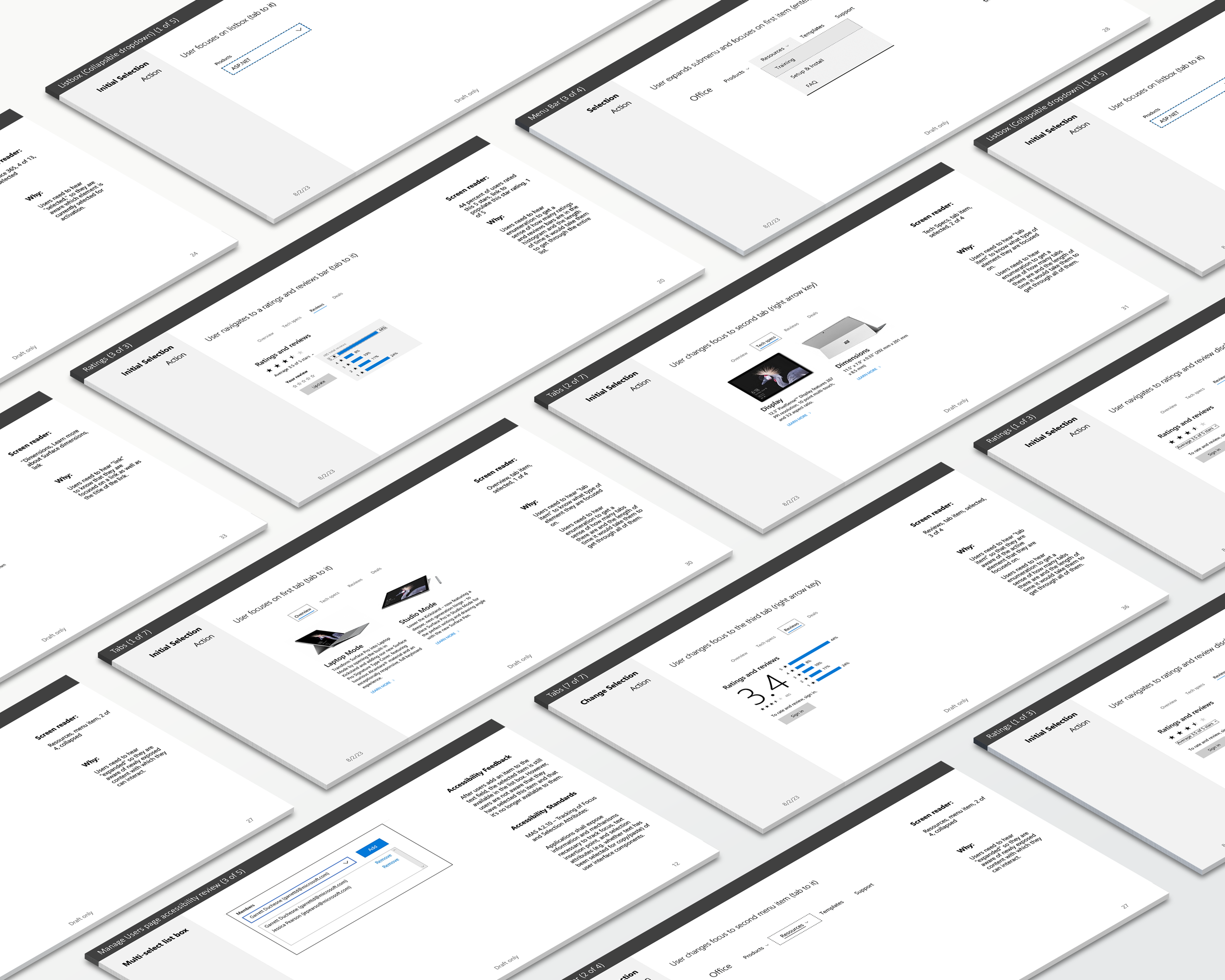
User testing and evaluations revealed that many users faced challenges in navigating and interacting with Microsoft products due to inadequate accessibility features. Common issues included difficulties in keyboard navigation, poor color contrast, and lack of appropriate ARIA role descriptions.

Clear descriptions for improved UI pattern understanding
The research findings highlighted the importance of providing clear descriptions and purposes for UI patterns. Users often struggled to understand the intended use and functionality of various elements, resulting in confusion and frustration. To address this, the Accessibility Tool Kit includes concise yet informative descriptions for each UI pattern.

Guiding ARIA role implementations for interactive elements
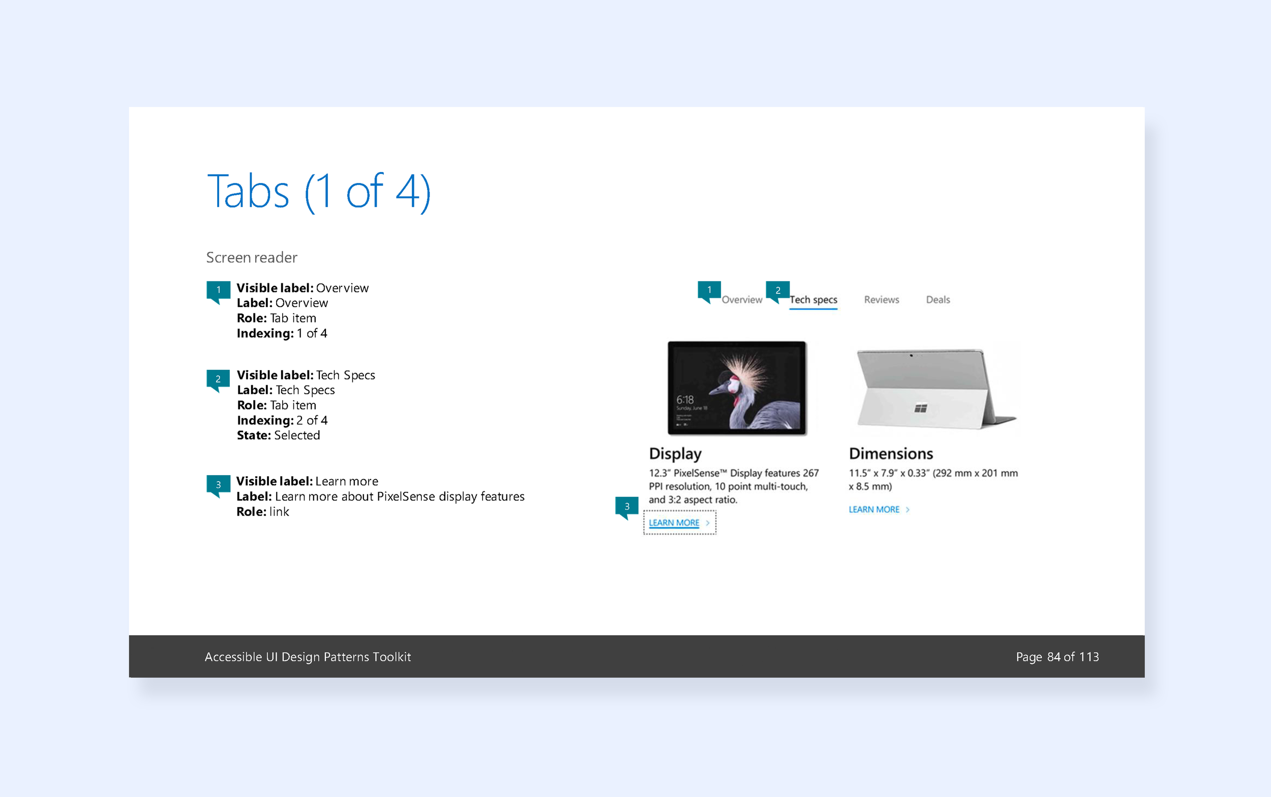
ARIA role descriptions were found to be inconsistent or missing in certain components, impacting the understanding of interactive elements for users relying on assistive technologies. The Accessibility Tool Kit provides comprehensive guidelines on ARIA 1.1 authoring practices, ensuring proper implementation of ARIA roles and properties.

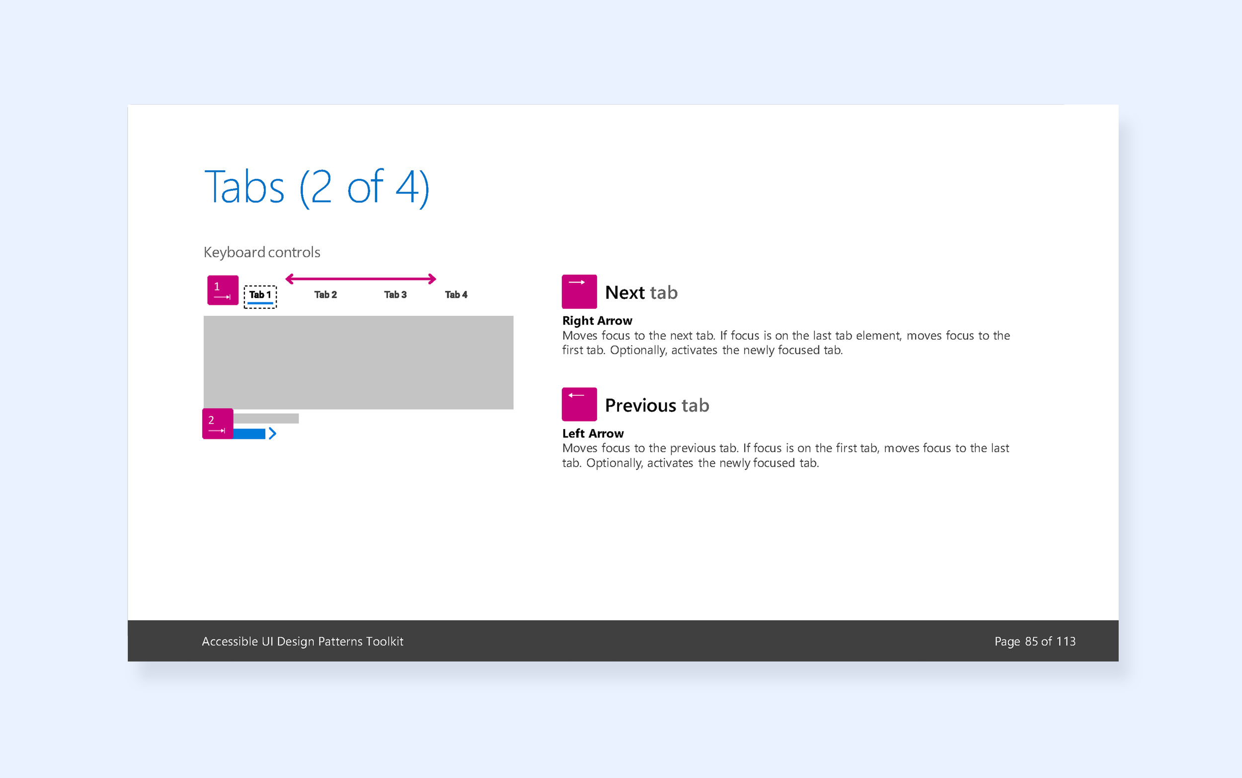
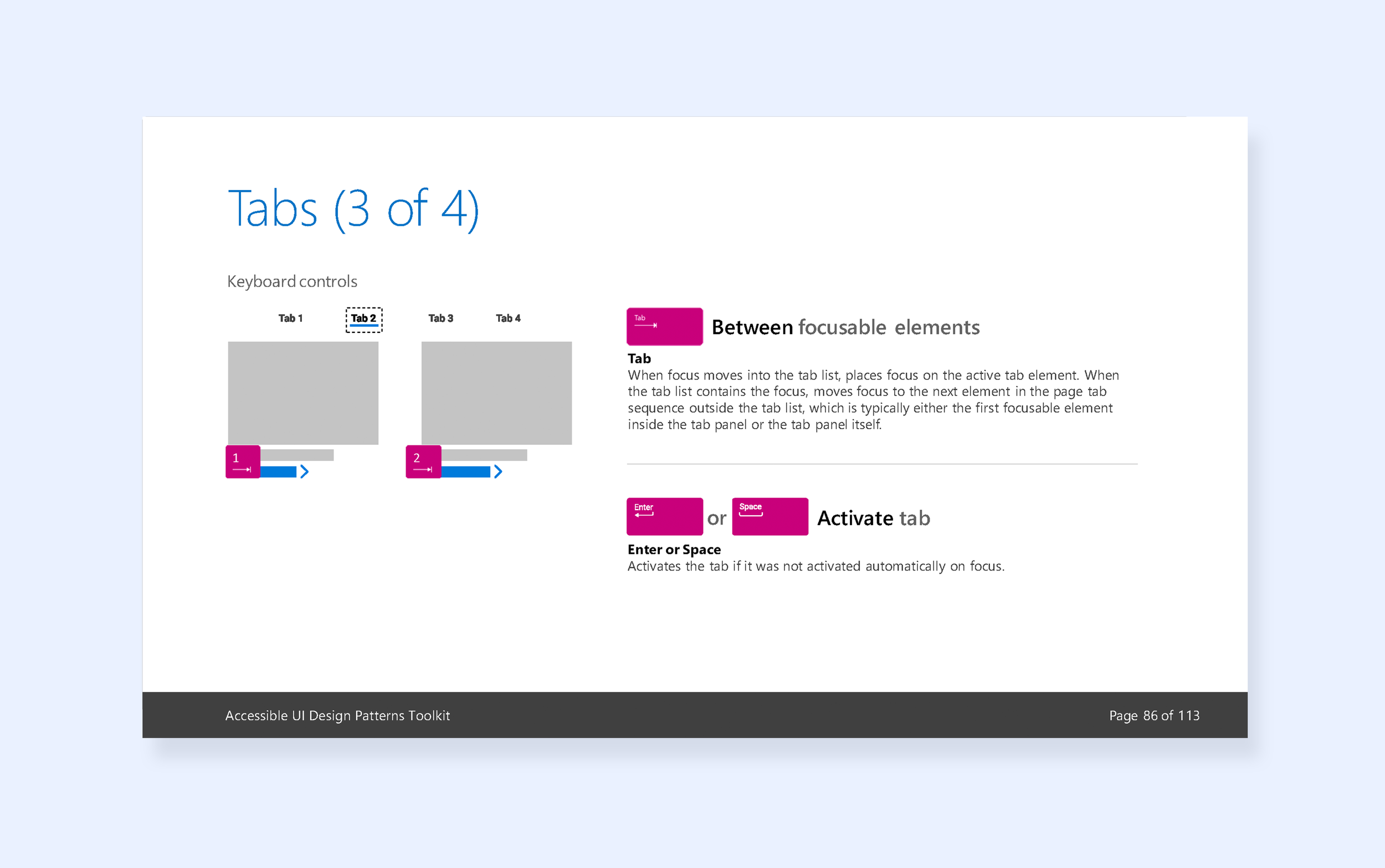
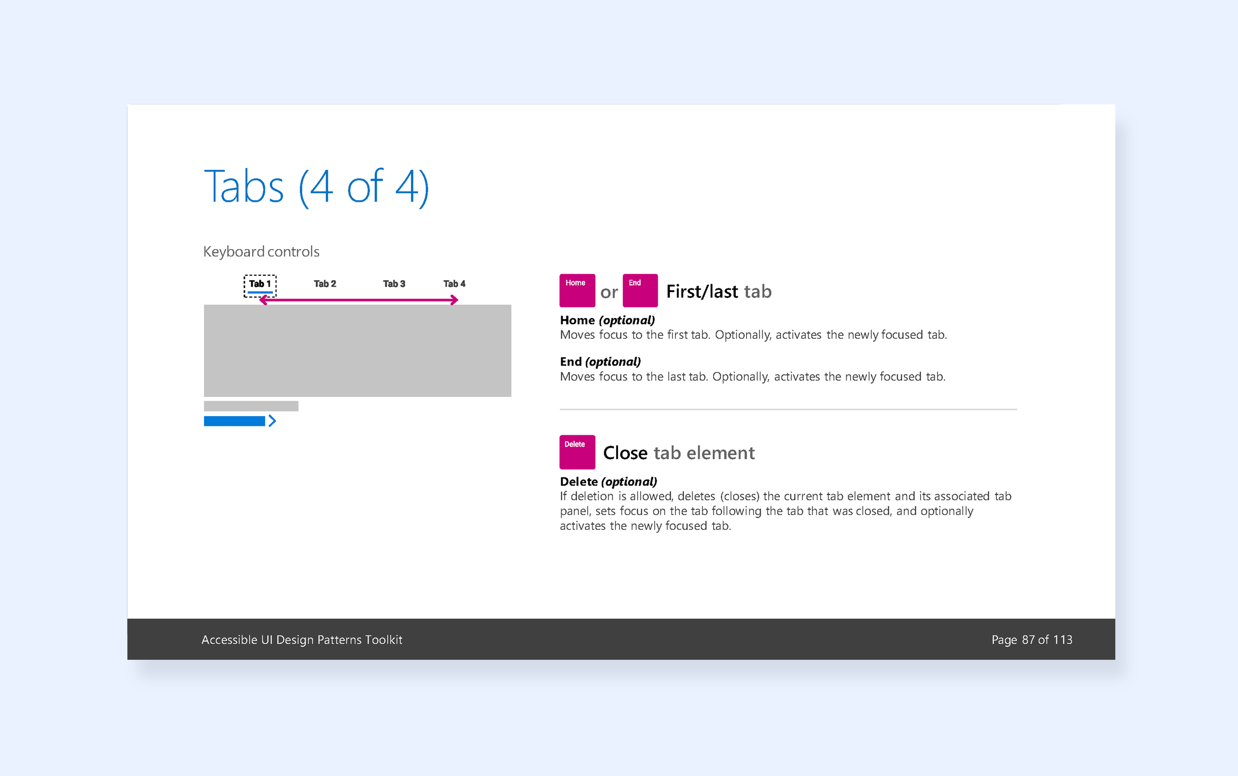
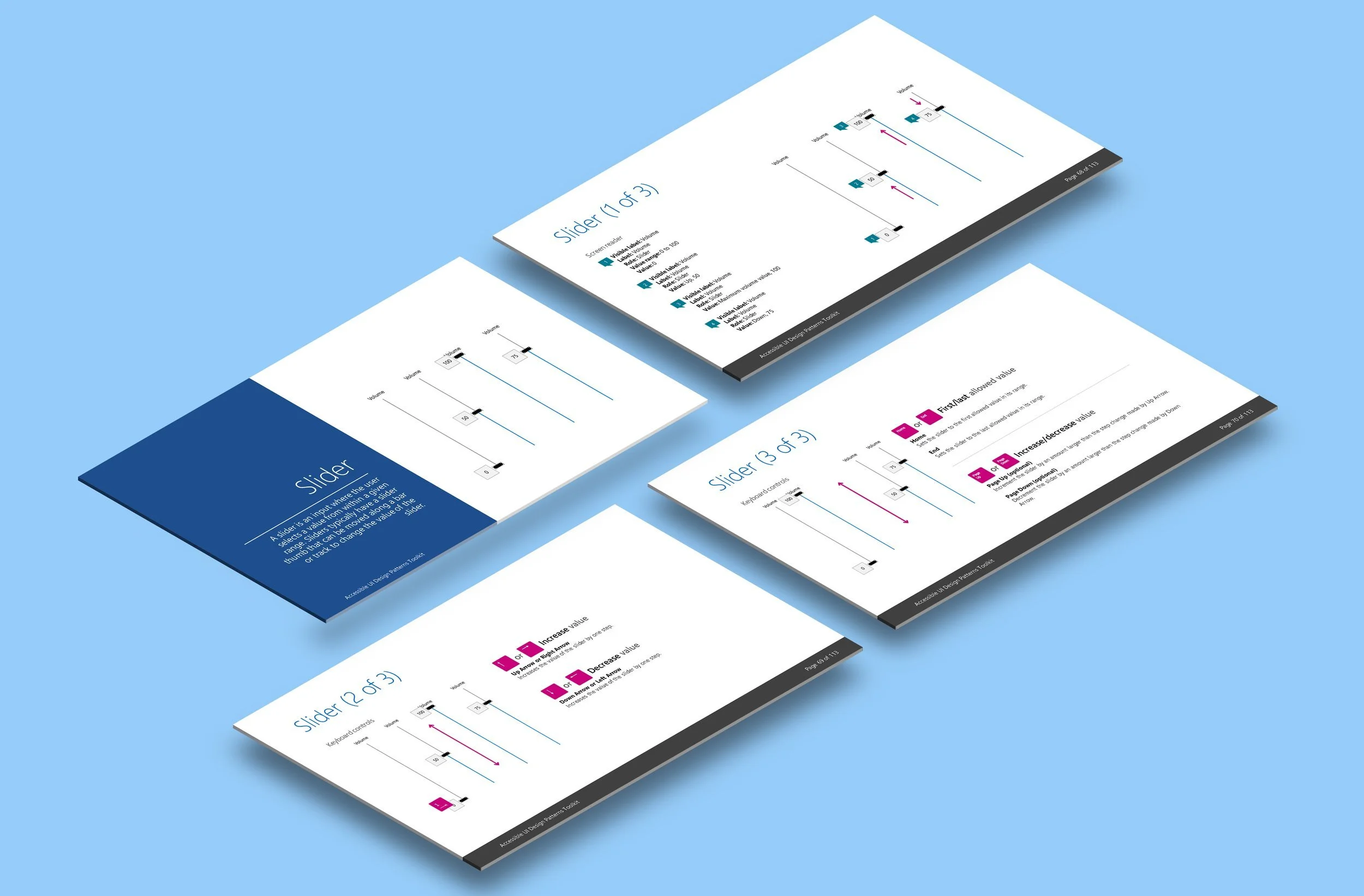
Enhancing tab and focus order for improved navigation
User feedback also emphasized the significance of proper tab and focus order. Many users with disabilities, particularly those using screen readers or keyboard navigation, faced challenges in traversing through the UI elements logically. The remediation efforts focused on optimizing the tab order and ensuring that the keyboard focus follows a logical and intuitive flow.
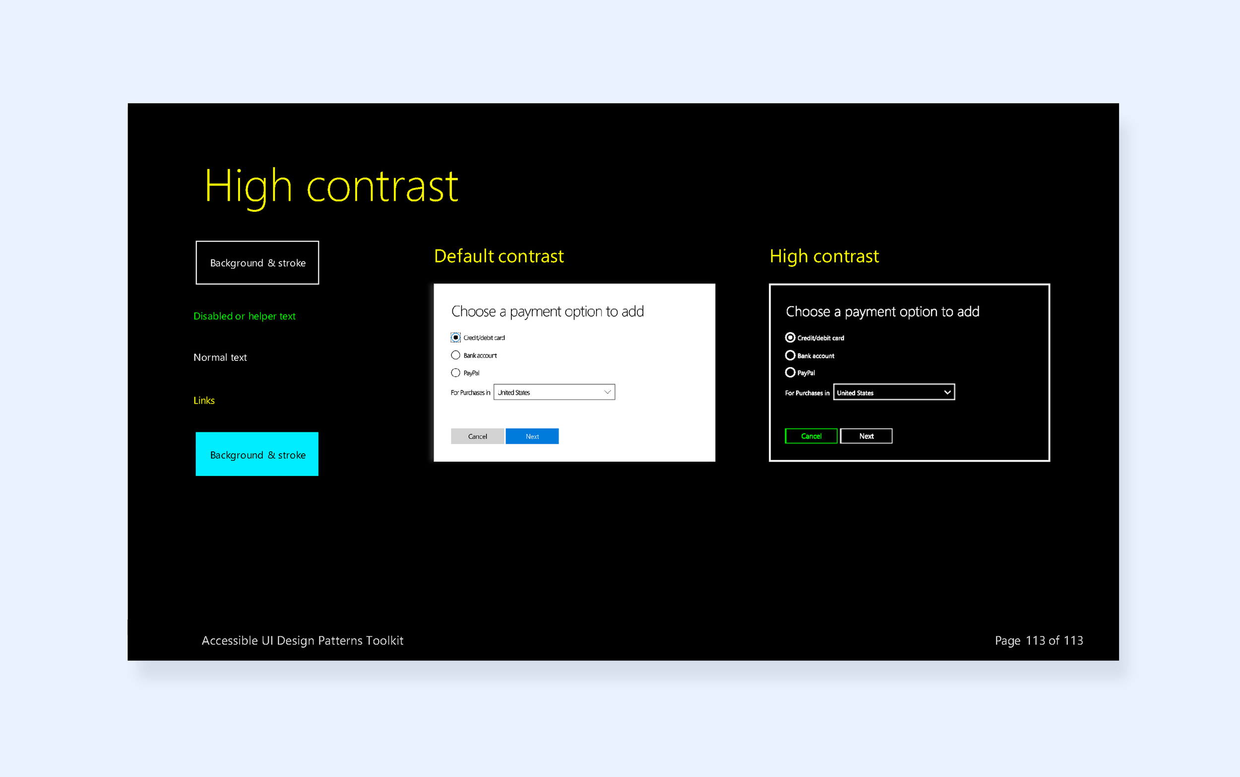
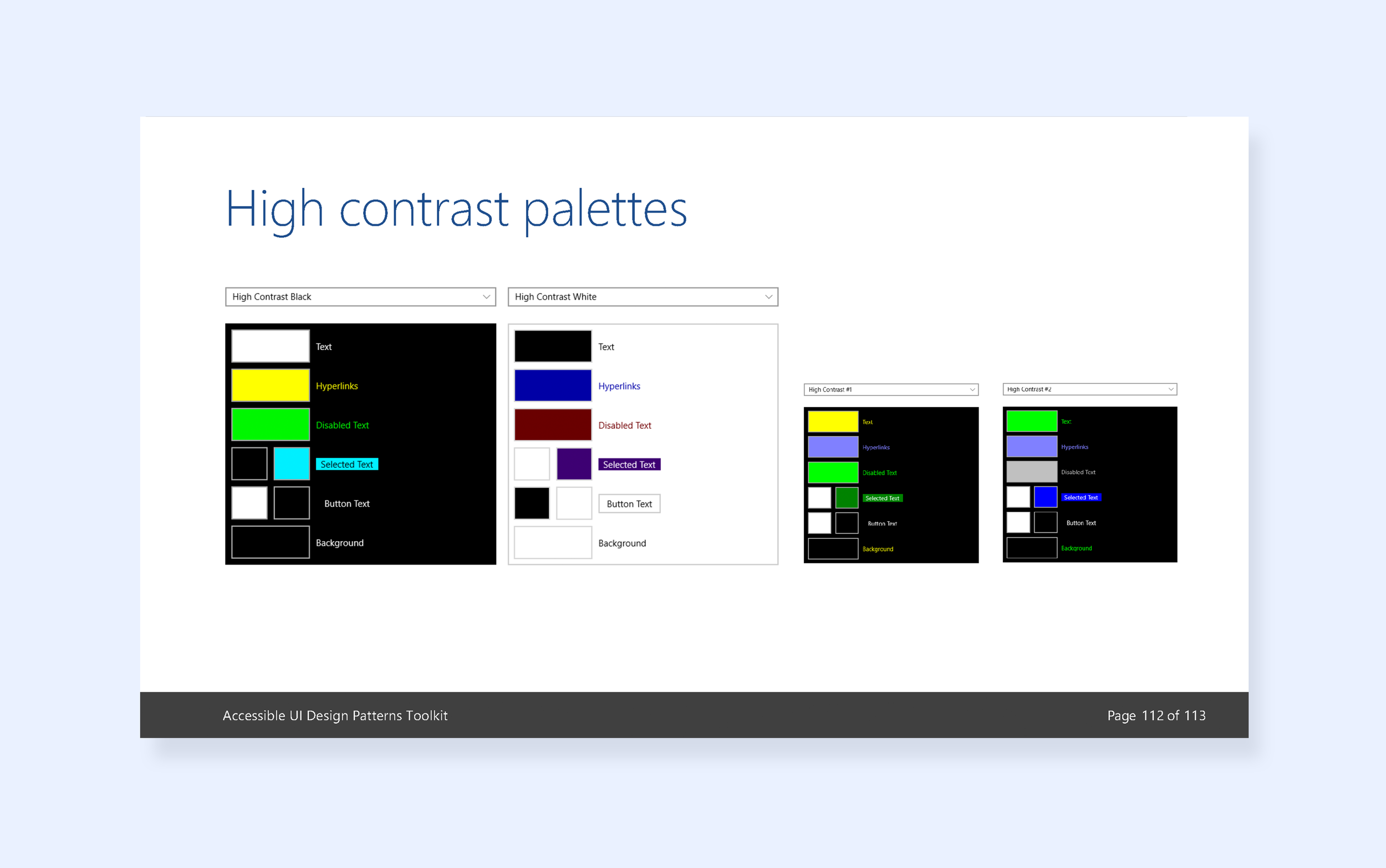
Improved color contrast for visual impairments
Color contrast emerged as a critical issue for users with visual impairments. Users reported difficulty in distinguishing between foreground and background elements, affecting their ability to read and comprehend content. As a result, the UI components were remediated to meet color contrast requirements outlined in WCAG standards, ensuring readability and usability for all users.
Reduced implementation time by 40%
The Accessibility UI Patterns Style Guide empowers the team with guidance on UI patterns, tab & focus order, keyboard controls, tab elements, color contrast, and ARIA roles, ensuring inclusive experiences for all users. It results in a more accessible design system, streamlines UI component implementation, and expedited the launch of Microsoft Web Framework 2.0, empowering users worldwide.