Philips Healthcare
Reduced post-cardiac event review time on task rate by 23%
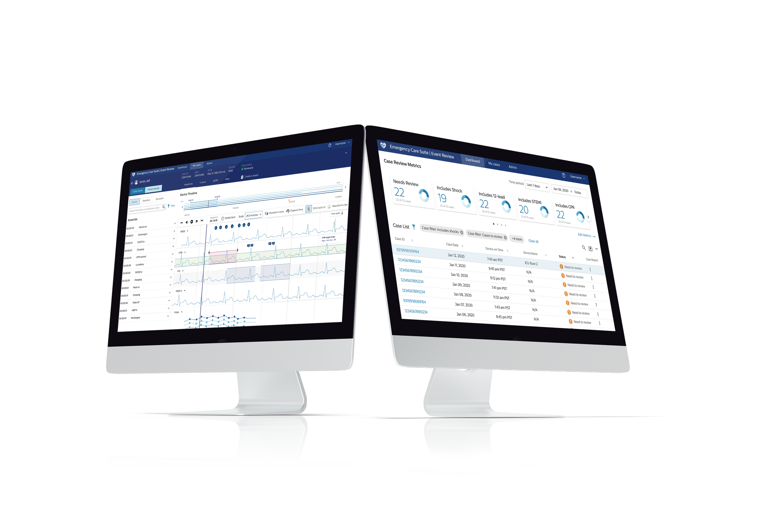
In 2018, Philips introduced the Emergency Care Informatics (ECI) Event Review, a cloud-based Software as a Service (SaaS) solution tailored for EMS and Hospital users, bringing significant improvements to post-cardiac event data transfer and analysis. However, users faced difficulties navigating the app and accessing crucial insights, resulting in compromised patient care and limited market potential.
Role
UX Designer
Year
2020
Duration
6 months
Deliverables
Card sorting
Workshop
Mockups
Prototypes
Usability testing
Final UI specs
Team
Usability Engineer, Product Manager, UX designer and Development Lead
Software and tools
Sketch, InVision, Principle and Balsamiq
Complete redesign of Event Review app with new remote patient monitoring
I was part of the ambitious design team to redesign the Philips Event Review review experience to enhancing quality care and improving patient outcomes for over 200,000 healthcare professionals worldwide.
Our design team's high-level goal is to create a meaningful solution that unlocks insights from cardiac event data, simplifies post-cardiac event analysis, improves usability for efficient data entry and retrieval from the point of patient collapse to the operating room, and empowers healthcare professionals to deliver exceptional quality care.
Learn more about Philips ECI Connected Care
Event Review 2.0
Activities and outputs
6 stakeholder interviews
Sitemap
5 user interviews
Heuristic evaluation
Streamlining clinician workflow and patient case management
We discovered clinicians struggled with complex software, outdated case management for managing hundreds of patient case lists, and complexities associated with integrating multiple medical software.
“Digitization has unleashed a flood of data that presents a huge opportunity but is also overwhelming clinicians, nurses, and administrators.”
Activities and outputs
Sitemap analysis
Persona
Information architecture
Concept sketch
From patient collapse to the Operating Room (OR)
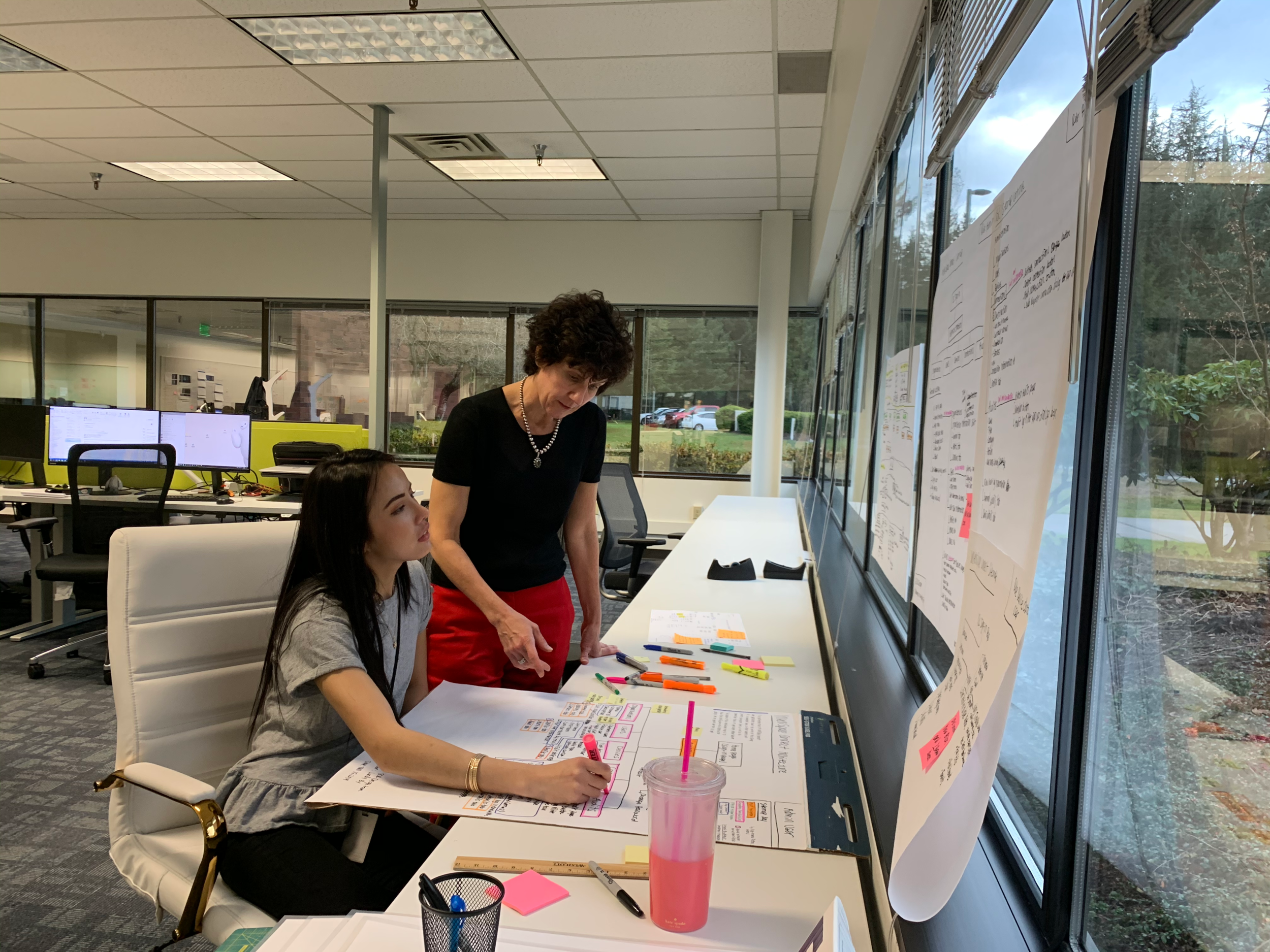
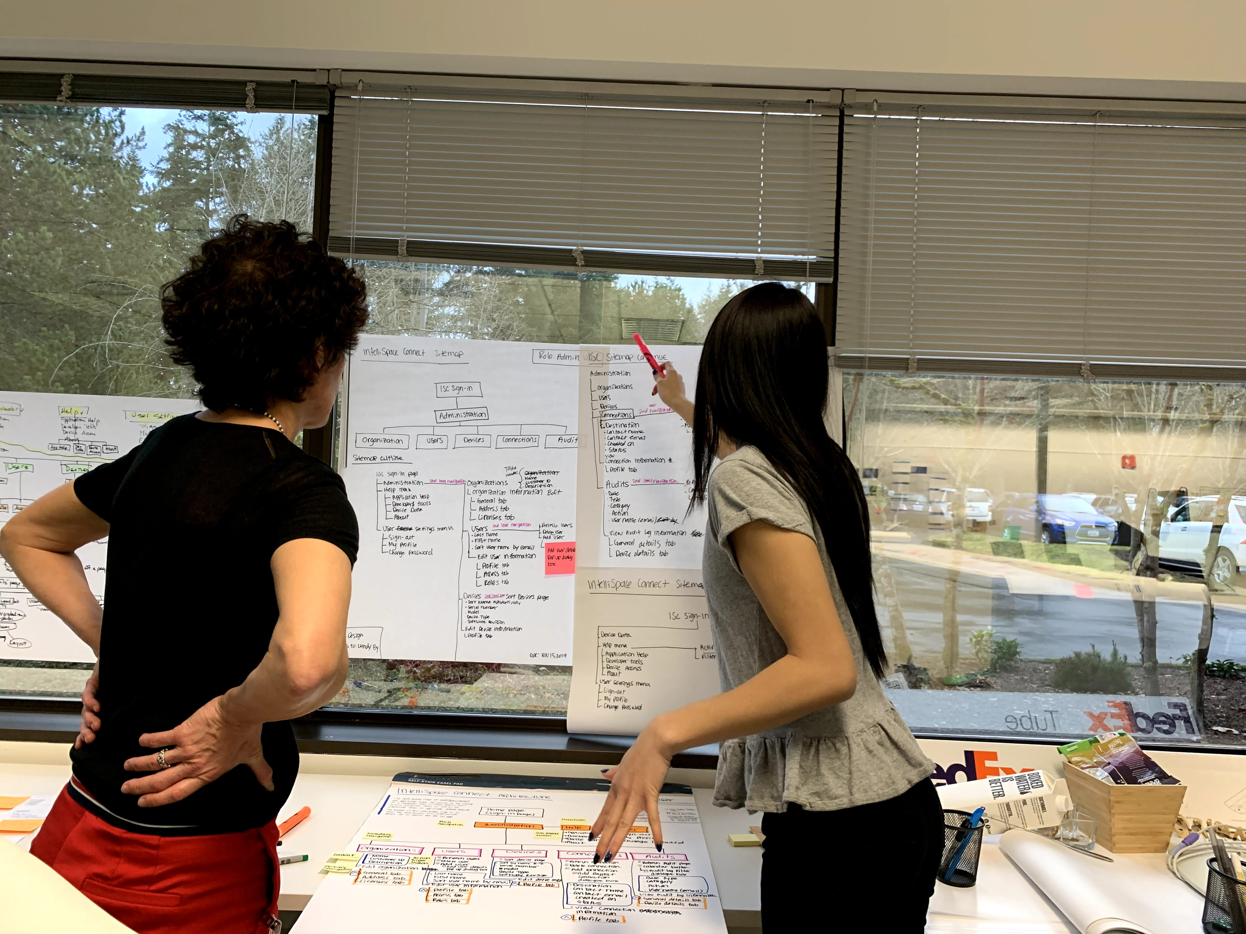
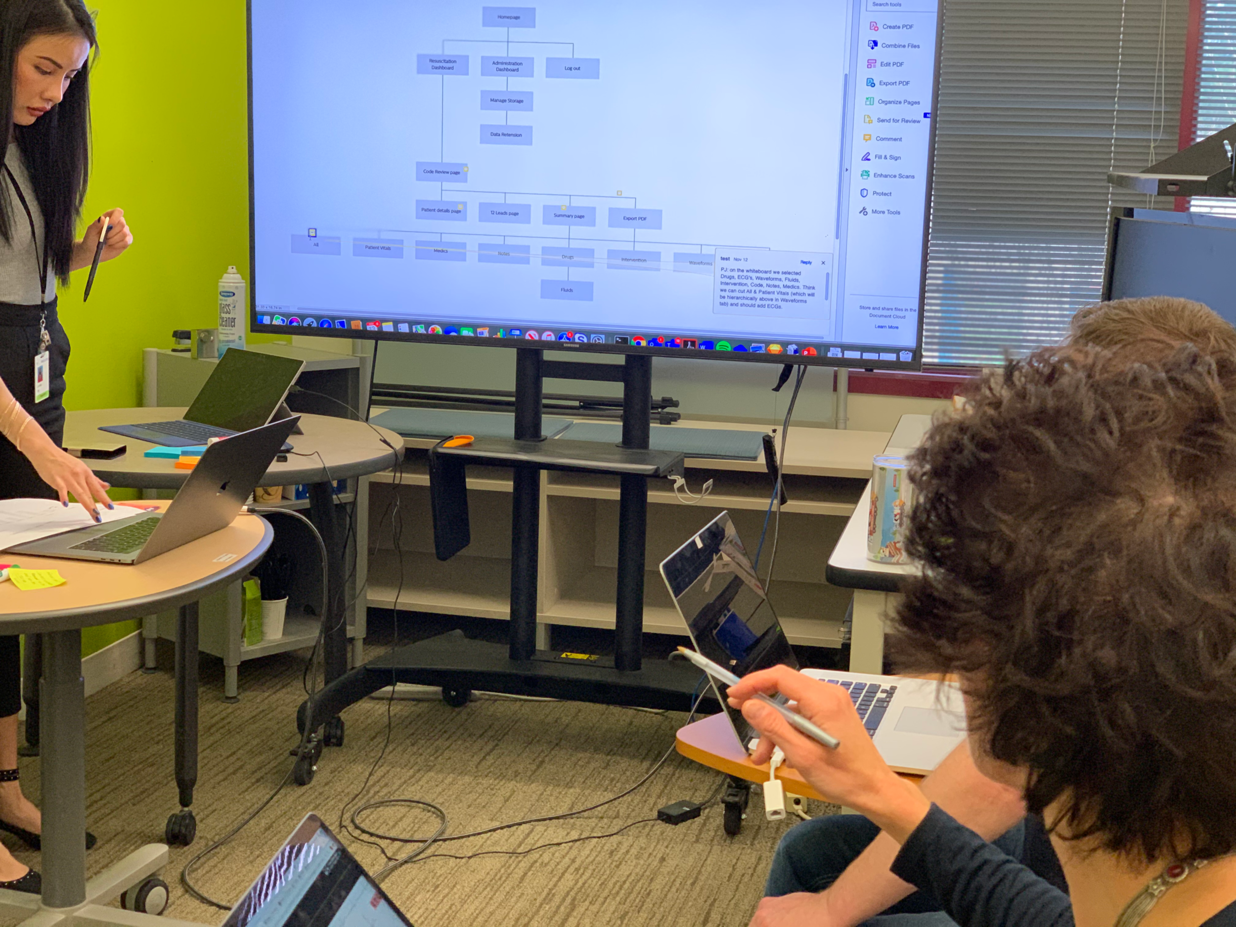
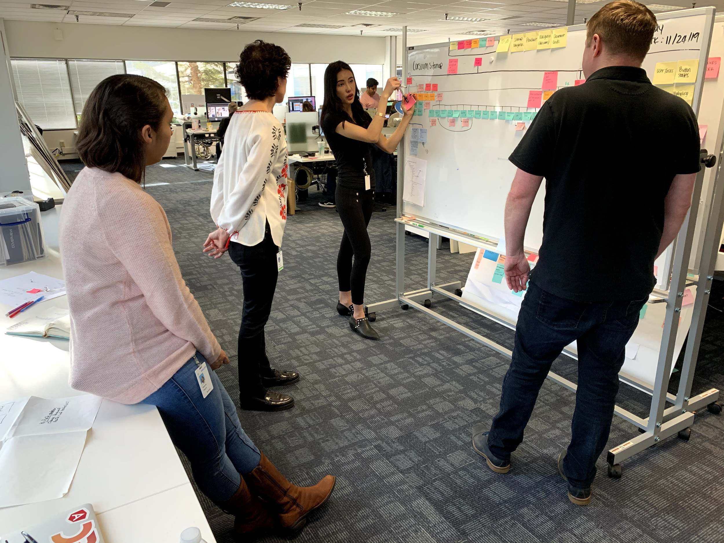
Through user interviews with the clinicians and EMS paramedics, I mapped out the clinical workflows for code review analysis and translated it to a sitemap which identifies the desired features and feature gap in the legacy Event Review application.
“The inclusion of full ECG in the Event Review system would greatly streamline our workflow. We wouldn’t have to switch between different systems to access comprehensive cardiac data, saving us time and allowing us to focus more on patient care.”
Activities and outputs
Design workshop
Initial concept
Paper prototype
Feasibility review
Integrating remote retrieval and EMR features into a complex legacy platform
We balanced the technical constraints of the legacy platform with the business requirements to ensure a consistent user experience across all Philips digital products. By incorporating a future roadmap for expanding the Philips Emergency Care Suite digital solutions, we aimed to reduce learning curves for users and provide a unified experience.
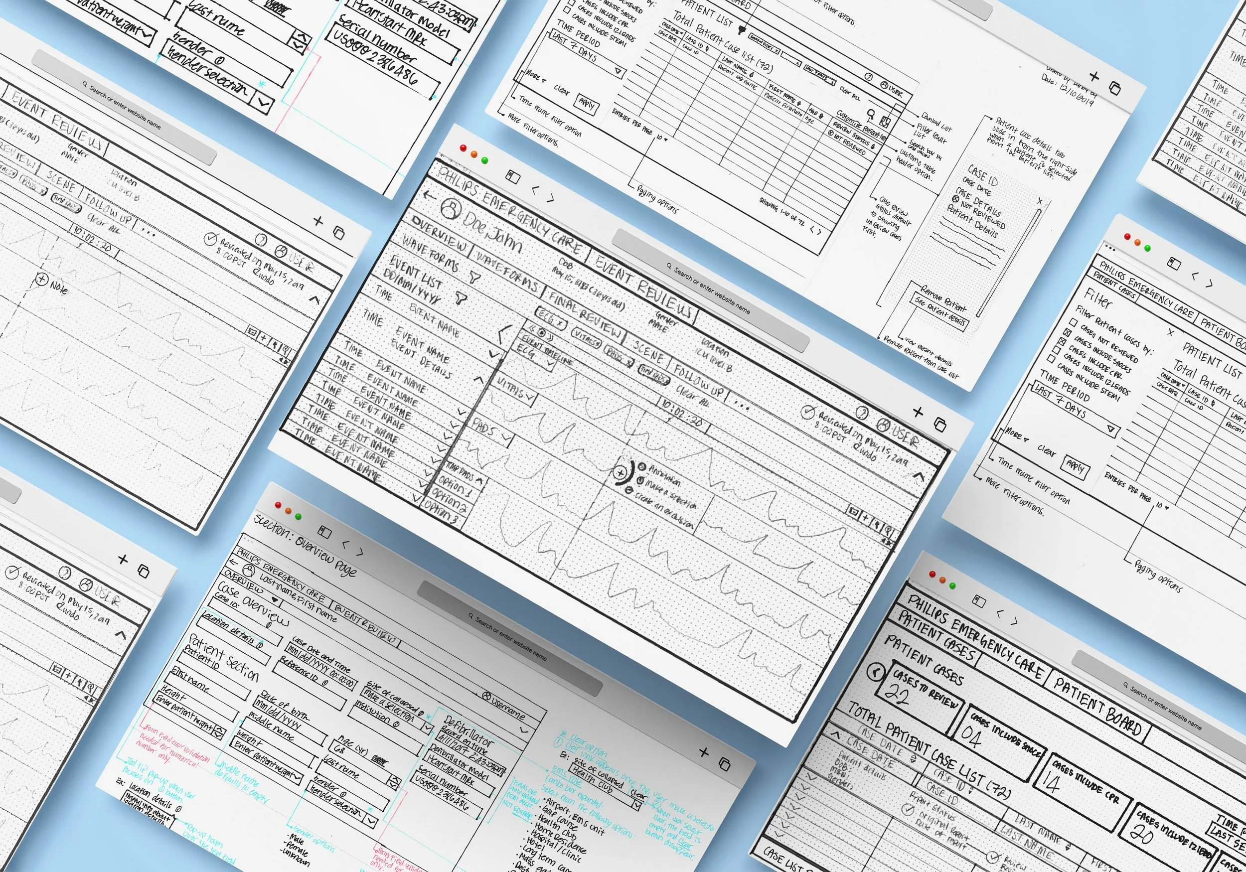
I rapidly created wireframe sketches for the patient dashboard, code review and patient details page and invited internal clinicians to provide feedback for each design iterations.
Activities and outputs
Card sorting
Wireframe
Internal user testing
UI flows
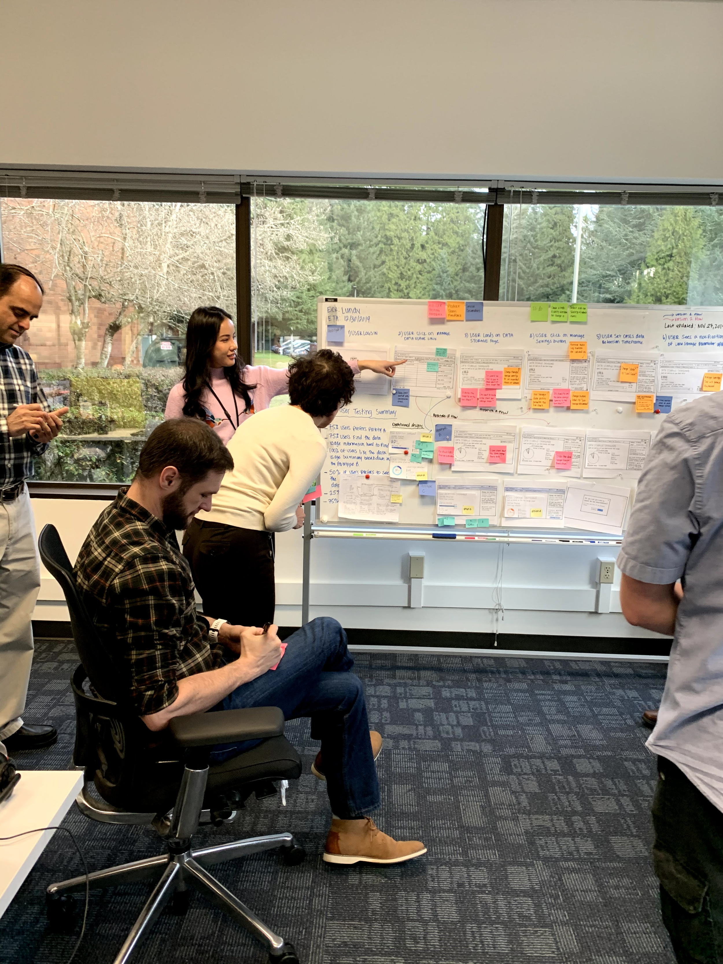
Led the design workshops with the R&D and product development team to create initial concepts and tested the design concepts with clinicians.
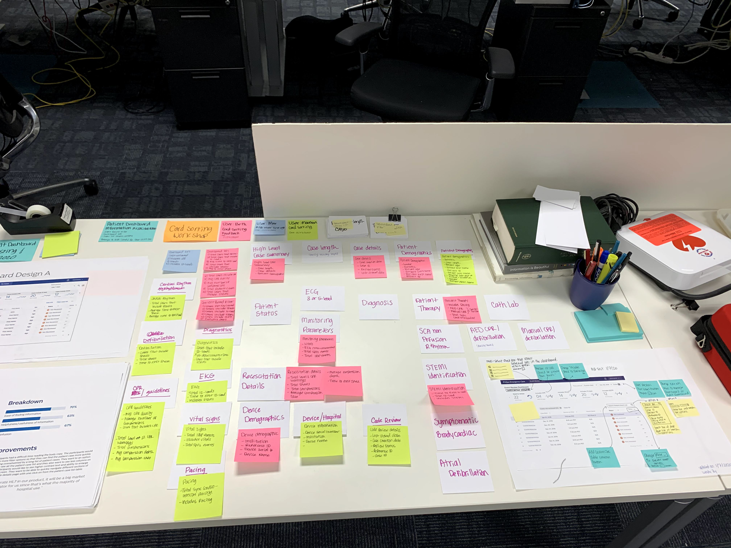
We conducted card sorting with clinicians to resolved terminology inconsistencies, ensuring that code review and patient case terminology is consistent with the industry standards.
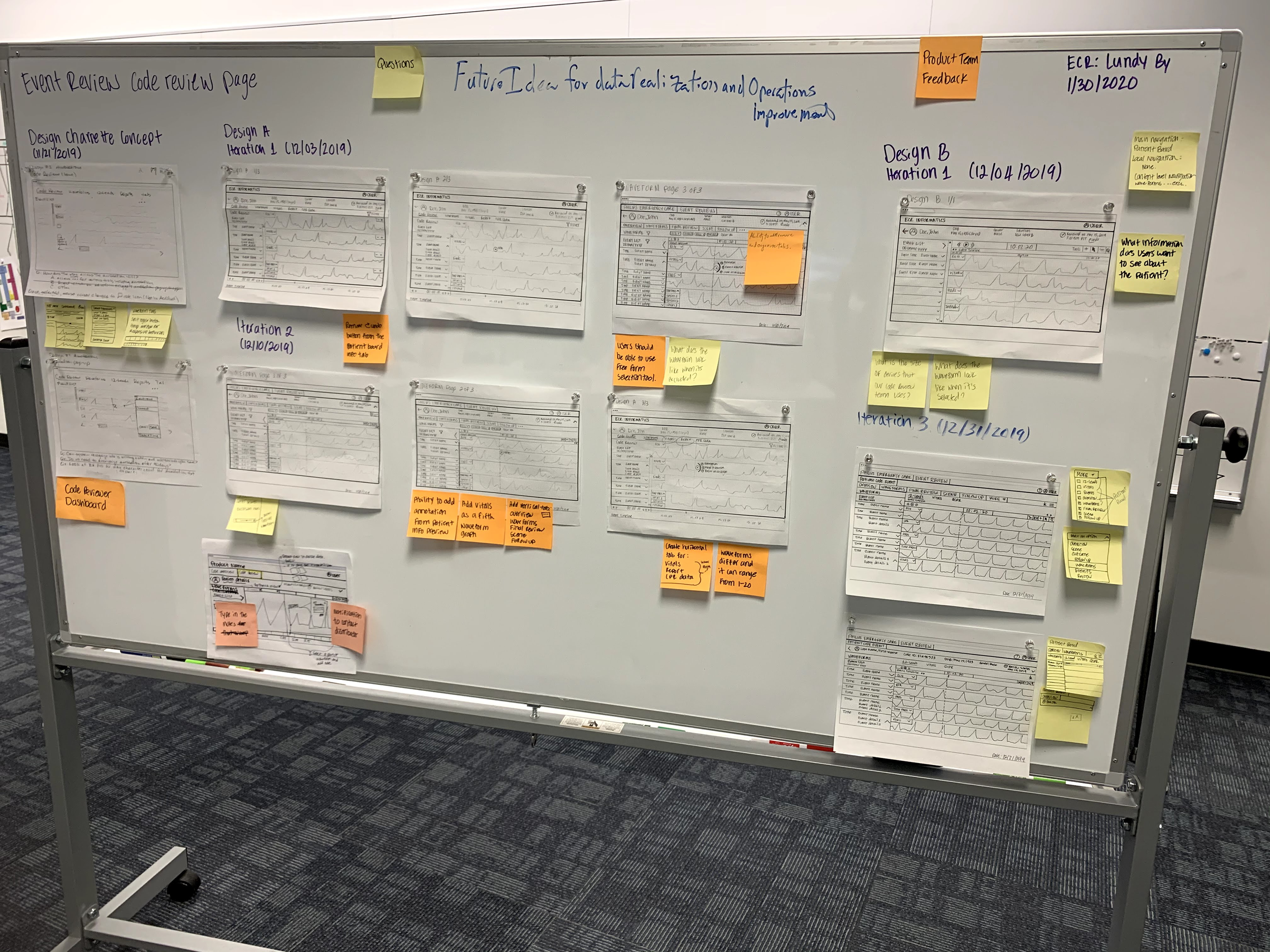
User feedback indicated that finding case IDs and conducting code review data analysis were sources of frustration.
Activities and outputs
Low-fidelity mockups
Design review
A/B user testing
UI mockups
Lack of clear visual indicators and labels for streamlined interaction.
Based on user feedback, we replaced the red “x” symbol to an orange “!” for an informative visual cue for cases needing a review without overwhelming the user and prioritized cases with shocks and CPR.
“I appreciate cases that include CPR and shocks. I find the big red ‘X’ symbol for ‘Not Reviewed’ a bit overwhelming. An orange ‘!’ would be a better visual indicator.”
Patient Dashboard Design Evolution
Activities and outputs
Prototyping
Formative usability testing 1
Design iteration
Design review
Enhancing patient case navigation efficiency with a single-click
Based on user feedback, we implemented a direct link to the code review page in the case ID, allows users to swiftly navigate to the code review page with just one click, streamlining the process of finding and accessing the desired code review information.
“Based on usability testing insights, users found it inconvenient that the patient dashboard required 3 clicks to access the code review page from the patient dashboard.”
Users had difficulty in quickly assessing critical code review information
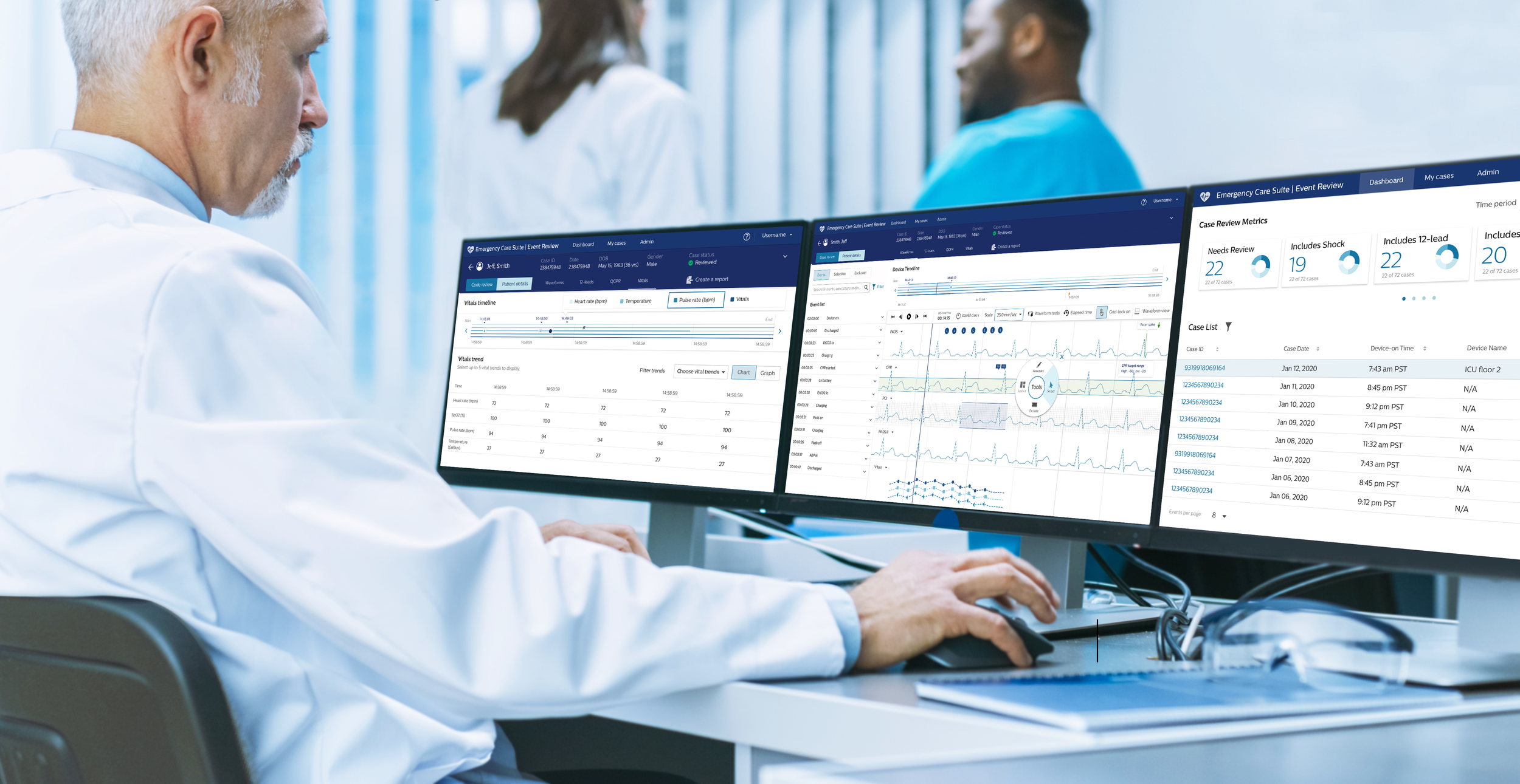
Users found it time-consuming to locate estimated time down, administered medications, code duration, and complicating rhythms, during code reviews. The updated design prominently displays these key elements, allowing users to quickly assess the information at a glance, streamlining the code review process and facilitating timely decision-making.
“The top five things I look for in every code review are: Estimated time down to start of time to recording of EKG, what medications were given, length of code, and were there complicating rhythms.”
Users found it unclear how many pages to fill out and how to navigate to the next page, causing confusion
The usability testing highlighted user pain points with the patients detail page, specifically related to uncertainty about the number of pages to fill out and how to navigate to the next page.
“Users were not clear on how many pages need to be filled out or how to get to the next page. This applies to both the page itself and the dropdown menu next to the Overview page.”
Optimized for touch and web platforms
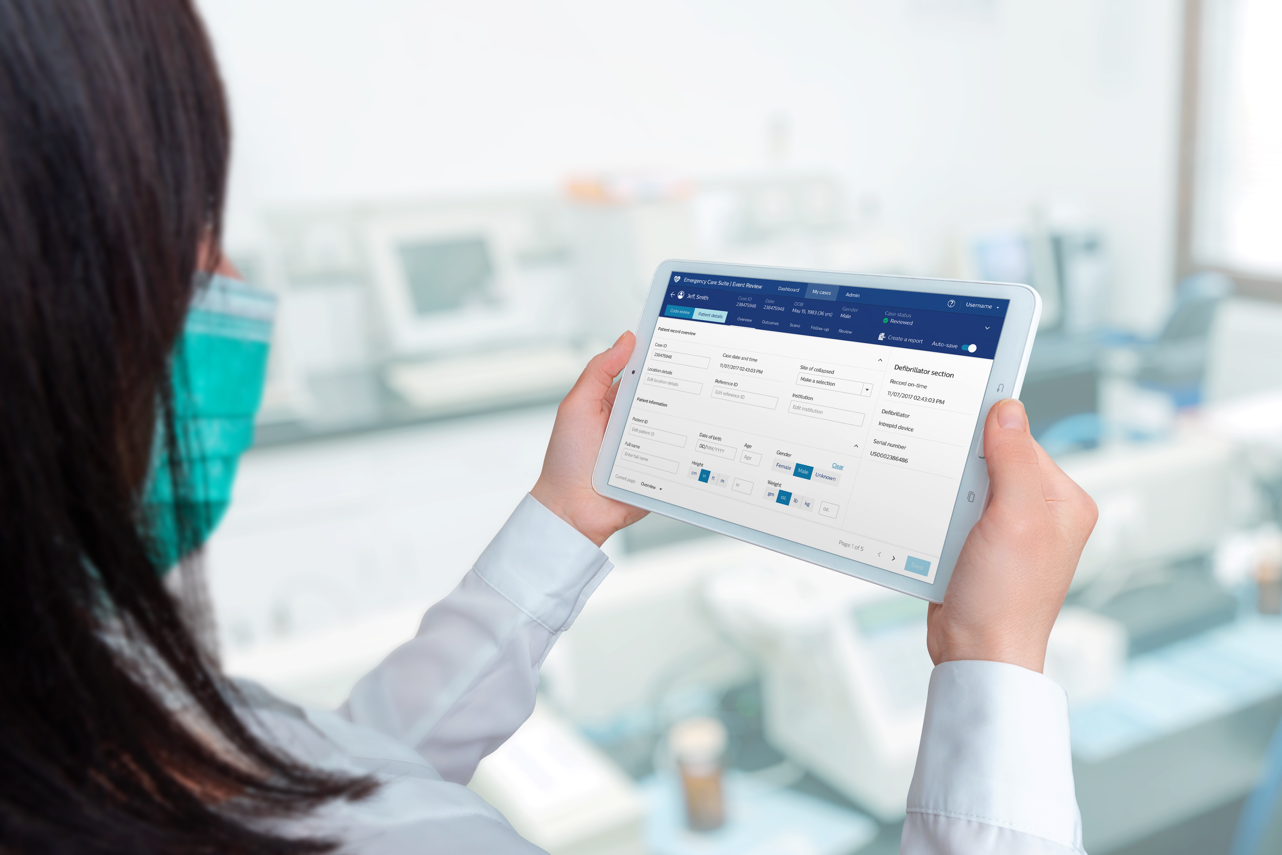
Based on user feedback, we have tailored the application to accommodate the preferred use of tablets for inputting patient details and case information, ensuring a seamless experience across devices.
Activities and outputs
Prototyping
Formative usability testing 2
Design review
Final UI Specs
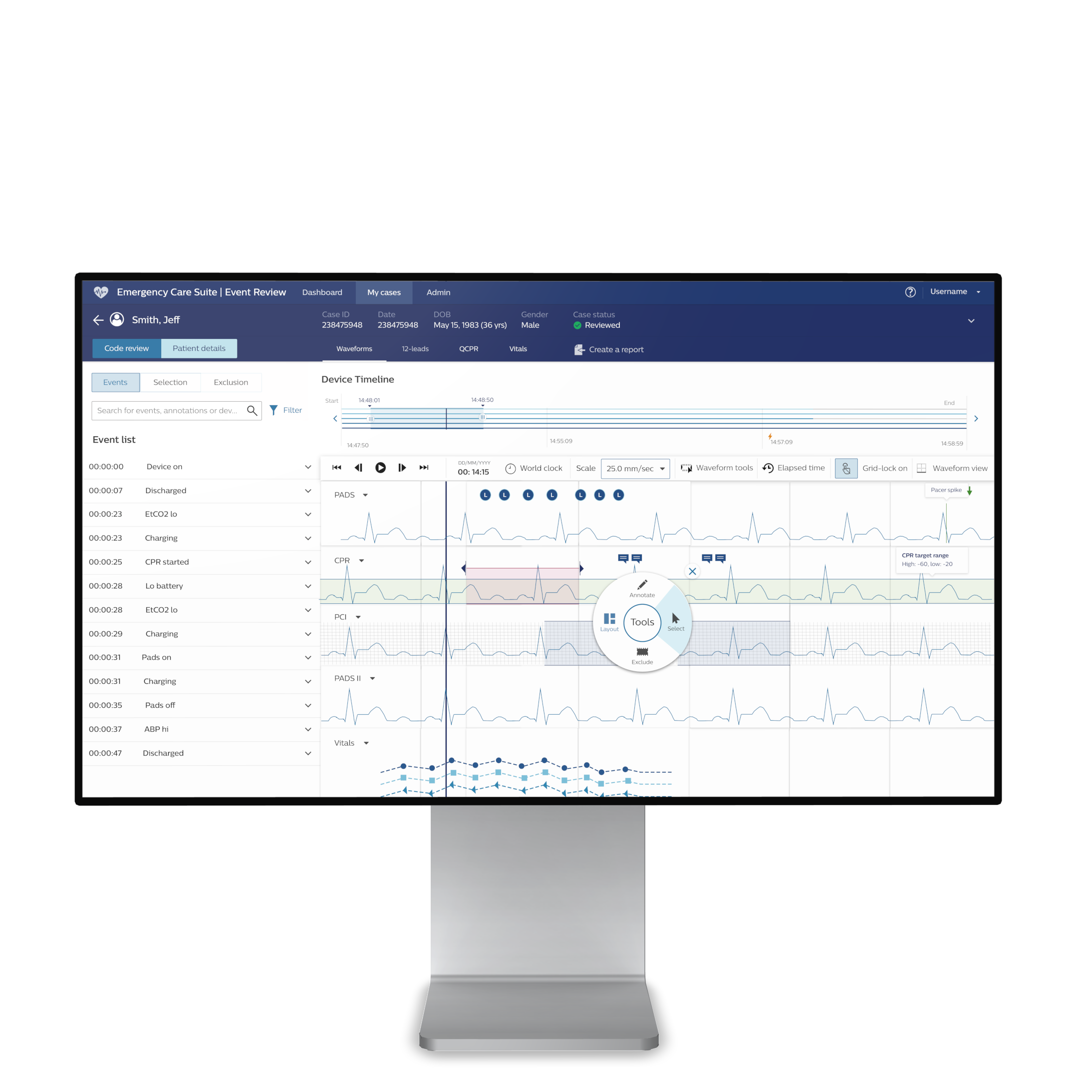
Users struggled with waveform analysis due to the lack of a pacer spike indicator and CPR range
The new design addresses user pain points by adding a pacer spike indicator and CPR range for better waveform analysis, enabling multiple timeframe selection through control drag interaction, and introducing timeframe markers for clear data interpretation and manipulation.
“Users wanted to select multiple timeframes using control drag for efficient comparison and desired timeframe markers to mark and exclude specific sections to identify CPR range and Pacer Spike.”
Interactive waveform visualization
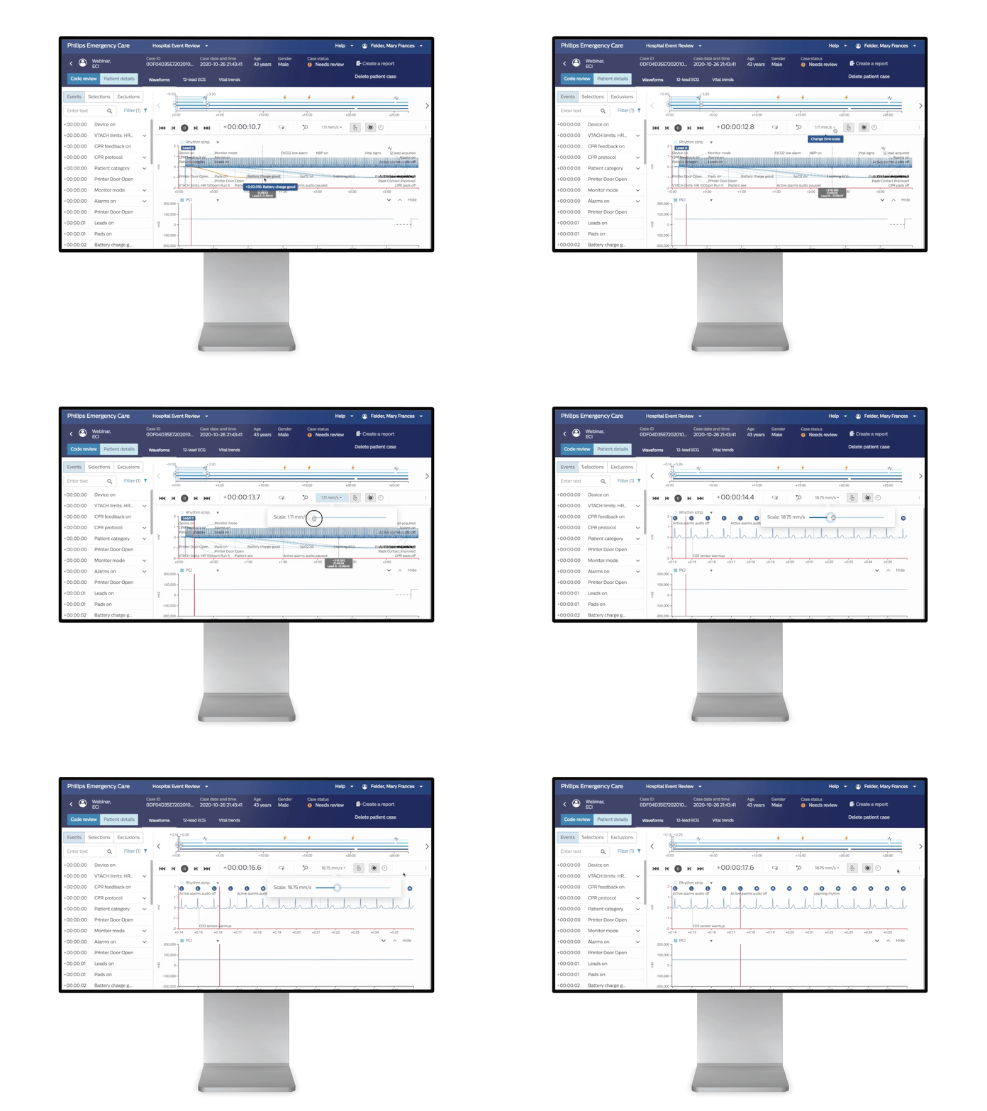
Based on user insights regarding the lack of waveform scale for focused analysis, we introduced interactive features that enable users to manipulate and interact with the waveform. This includes the ability to zoom in on specific areas of interest, adjust scaling, and navigate through the waveform with ease, facilitating a more detailed examination of the ECG.
Single-click access to dynamic waveform annotations and markings
The new design enhances usability with a radial menu for multi-select waveform feature, clear visual indicators, and color coding for code events. Intuitive popup info tips guide users in utilizing waveform features effectively, including exclusion, sectioning, annotation, and modifying layout, with the ability to annotate waveforms for highlighting findings or abnormalities.
Users wanted quick access to the waveform legend and effortlessly view patient vital trends
The new design optimizes the code review process by placing the waveform legend at the top, introducing seamless view switching with tabs, implementing distinct color contrasts for vital lines, and providing a popup legend, resulting in improved efficiency and a smoother workflow.
“I was frustrated by the need to scroll down to access the waveform legend, as it disrupted my workflow. Similarly, switching between chart and graph views in the drop-down menu was time-consuming and required multiple clicks. ”
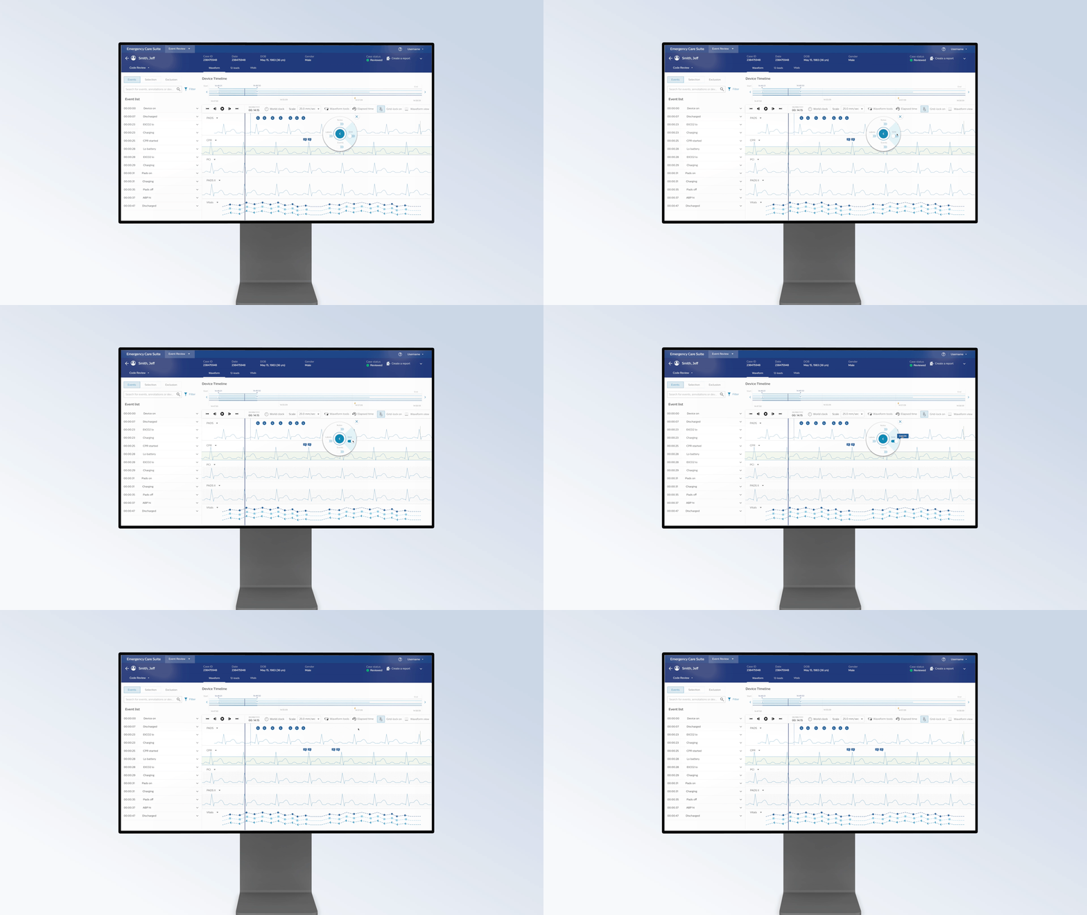
Accelerating Development with Rapid Prototyping
We test the prototypes in formative testing to validated the design requirement and UI specification before implementation, resulting in a 25% reduction in development time and an accelerated product market launch.
Scalable Design Systems
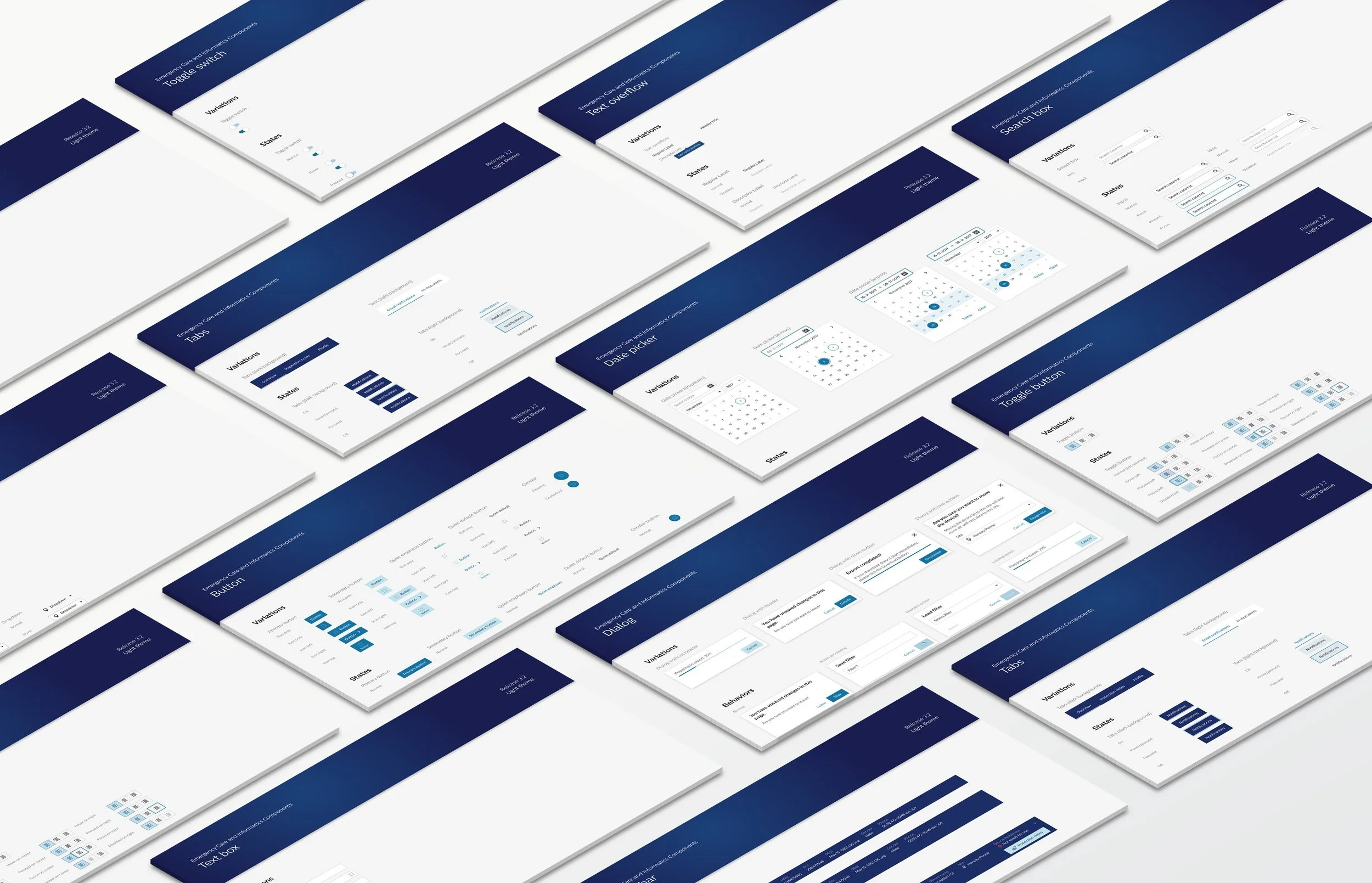
I built reusable UI design components library using the Philips Design Language System and accessibility guidelines to speed up development for future releases.
Postive Impact
-
Increase the number of reviews completed per clinician by 25% with the new design.
Formative Usability Testing
-
Increased the Event Review application usability score, from 3.5 out of 5 to 4.6 out of 5.
Formative Usability Testing
-
Reduced average time on task to complete post-cardiac event reviews by 23%.
Formative Usability Testing
Successful product launch — driving industry interest and new sales contracts.
I delivered the final UI specifications under the Philips QMS system and collaborated with the product management team to further improve the Event Review application to accommodate to diverse terminologies used across hospitals and EMS agencies globally.


